 |
tuchulcha
0.10.1
Graphical Workflow Configuration Editor
|
|
tuchulcha
0.10.1
Graphical Workflow Configuration Editor
|
Here you find a description the elements in the tuchulcha application window.
The keyboard shortcuts described below may depend on your system platform. If the described ones do not work as expected, have a look at the corresponding entries from the menu bar (file,edit,view,etc.). Each action is shown there with its current shortcut.

The export function offers the possibility to export the displayed workflow to an image file. Currently, all pixel types that QImage can handle are supported (including png,jpeg,tiff,bmp). Additionally the vector formats ps and pdf are supported too, just select the desired output format from the format filter (usually at the bottom right of the save-file dialog).
The next section offers the options to update the plugin metadata and to execute the active workflow. This is described in detail in Interaction with Charon-Suite Plugins.
The next three buttons are used for editing the currently active workflow. They work as described in Editing a Document. Their functionality is also available via the context menu (e.g. right-click on a module in the workflow). Not that these buttons have no effect if no module is selected or if there is no opwn workflow widget.
The zoom buttons adjust the magnification of the workflow widget content. Alternatively it's possible to zoom using the mouse wheel combined with the CTRL key.
The last section provides access to the tuchulcha help. The short introduction is equivalent to Introduction and is displayed in the Help browser. The help button should open a new window showing the documentation you are now reading. If this documentation display based on the Qt Assistant is not available, a help page is also displayed in the Help browser.
On application start, there is no Workflow window available. You can open an arbitrary numer of workflows via opening existing documents or creating new ones.
The Workflow Widgets are arranged in Tabs in the Main Window (in a so called MDI area). The tabs may be rearranged by moving them with the mouse. It is possible to view multiple workflow files at a time, e.g. by tiling the window or cascading the MDI subwindows. These options are available from the "view" menu or by the shortcuts CTRL+Z (tile) or CTRL+SHIFT+Z (cascade). The tabs may be closed using the middle mouse button, CTRL+W or the context menu of the tab title. Additionally there is a close button on each tab.
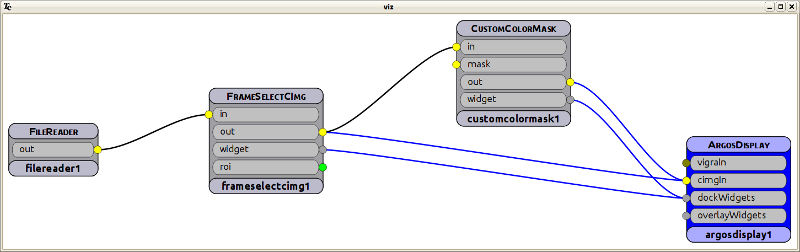
The flow window shows the flowchart representation of the object structures found in the associated parameterfile document. This structure can be edited by drag&drop (see Editing a Document). This visualization may also be exported to an image file, as described in Tool Bar.
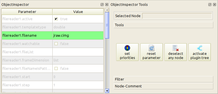
Unset parameters are shown in gray, the shown value is the default value found in the Module Metadata. The parameter values can be changed e.g by pressing F2 or simply by clicking on the value you want to change. Changing an unset value will change its status to "set". Set parameters are written to the workflow description file on save. Unset parameters are removed from that file. To reset parameters to their default value, select "reset selected parameters" from the "Tools" tool box (or use the shortcut CTRL+Backspace).
To get a short documentation for a parameter, point at it with the mouse. A tooltip containing its short description will appear.
It is possible to assign a priority (low, medium, high) to each of the parameters shown in the object inspector. The priority changes the higlighting of the parameter row (green,yellow,red) and may be used to filter the view e.g. to show only parameters with at least a low priority. The default priority is even less than "low".
The priority may be assigned using the third column of the parameter list view (columns: parameter,value,priority) or via the "set priorities" button from the "Tools" tool box. This button is also useful to assign a priority to more than one parameter at a time since it sets the priority to all currently selected rows. Note that the third column of the parameter list may be shown/hidden via the context menu of the header line of this table.
Filtering by priority is offered in the Object Inspector Tools window in the "Filter" tool box. This is especially useful in combination with deselecting the current object (in the "Tools" tool box) causing the parameters of all objects in the workflow to appear.
It is possible not to enter an explicit parameter value but a reference to another parameter, e.g. from another node in the workflow. This may be done by writing @<objectName>.<parameterName> as (pseudo) parameter value. If the input widget does not offer the possibility to enter plain text (e.g. on numeric values), you have to edit the (plain text) parameter file in an external editor.
On linked parameters, the presented value is the value from the link target, the name of the link target is shown in the status bar when mouse hovering over the value. Changing the value of a linked parameter removes that link and inserts the new value instead.
In the "Node-Comments" tool box, you find a possibility to add comments to the currently selected object in the workflow (it is disabled if there is no object selected). This comment will be shown as tooltip of that object. It is shown there with html markup (Qt subset).
Using the "active" parameter which is available in every node in the workflow, it is possible to control which of the modules are really executed.
Setting this to false causes this plugin and all objects connected to its outputs to be skipped from execution. Deactivated nodes are displayed in red in the workflow widget.
Setting this to true causes this object and all objects connected to its inputs to be activated again. To activate an object and all objects connected to its outputs, use the "activate plugin tree" button from the "Tools" tool box.
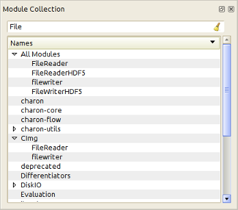
You can filter the shown templates by entering an expression (possibly with wild cards) into the filter field. Only classes containing the given text in their class name will be shown.
Clicking on a class in the selector widget will show the corresponding class documentation in the help browser.
The object inspector widget is organized as a tree view. The first parent item shows all available modules. The following parent items show only subsets of all modules, grouped by the package they are from (like charon-core, charon-utils etc.) or by purpose (DiskIO, Differentiators,...) or by used data types (CImg, vigra,...). These groups should simplify to find the right plugin for your needs.
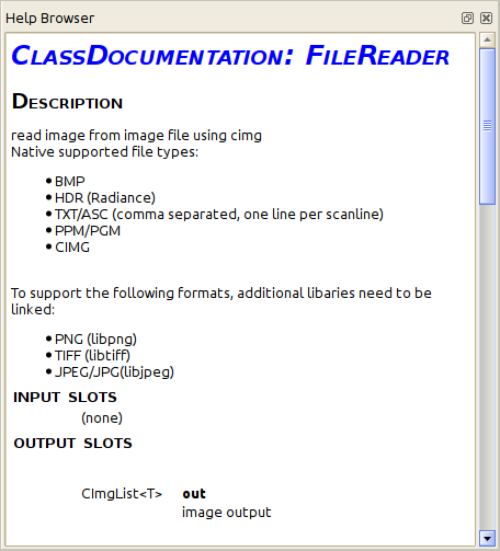
The class documentation of the available modules contains a general module description and documentation of all parameters and input/output slots. It shows their types and default values (if available).
If support for html help or qt help is available, the Tuchulcha help is not displayed in the help browser but in a standalone help viewer. The content displayed in this viewer is exactly the documentation you are currently reading.
 1.8.6
1.8.6